characterization

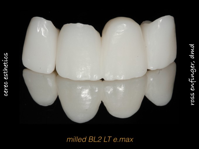
#5-13 are prepped and designed, so I have complete artistic control over the esthetic choices in this case. Looking for some feedback before try-in.


Ross,
CRAZY GOOD!!!!!!!!!!!!!!!
Staining and Shape are spot on.
Nit picking – The INCISAL embrasure on 8/9 could be “Very Slightly” deeper/wider, and 9/10 more like 7/8; and moving the facial line angles of 8 & 9 more medial will give the restoration a little more depth.
Otherwise, you nailed it.
Please show us the final.


The characterization looks great. Care to elaborate on how you did it? What was used etc..
The only thing I would change is what James mentioned. I would define the incisal embrasure a bit more on 8 and 9 and then see if you want to make 9 /10 embrasure match 7/8 more. Those can be done chairside once you see how it looks on the patient.

Great work, and agree with feedback. Would also be interested in materials and what was used...
Mark
Hi Ross, beautiful case. however to critique -why not have 3 unit fixed/fixed bridge and single crown and maybe could have separated centrals a little further.

Looking good. 8/9 incisal embrasure caught my eye as well.
I personally like the cervical characterization. Makes them look much more life like. Nice job Ross!
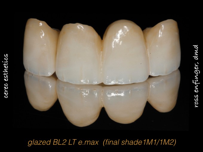
Thanks for the feedback everyone, as usual. I'm always amazed at how the camera brings out all the flaws. I appreciate and agree with everything that was said. Here's another perspective without the contrasting black background and with shade tabs (1M1/1M2).
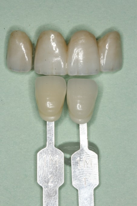
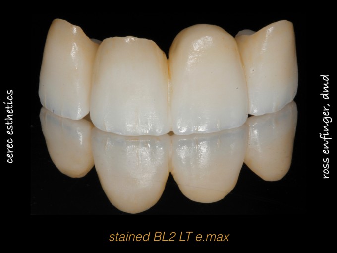
As for technique, since it was a bridge, I had to use LT. In the LT blocks, BL3 is usually my favorite, but it's not available in the bridge blocks, so I had to go all the way to BL2. It was no worry, though, since I planned to do several layers of stain/glaze to tone down the opacity and create the illusion of depth...which is all going to bring the value down. Ivoclar stains of brown#1 for chroma at the gingival 1/3 and blue IL1 in the incisal 1/3 for the first fire. Increase blue application for deep mamelon effect, white (W) on incisal, and interproximal chroma #1 for second fire. Craze lines with white (W) and brown #1 dropshadows on the craze lines (applied with endo file) for fire #3 plus some maverick staining. Lavendar (IL2) over the facial surface to mimic translucent enamel for fire #4. Finally, fluorescent glaze (FG) for fire #5. Knock back texture with grey Dialite, then polish with Diashine on a bristle brush. For better or worse, that's the formula I used. I'll definitely post the finished case.

Good job Ross. I would have slightly opened up the centrals embrasures just a bit more. Other than that perfect.

Looks great. Make sure you show us the post op pics. I agree with the others on opening the embrasure, but I get a little nervous about weakening the restoration.